New article
Recently updated
Add categories to a chart in the Custom Report Document Editor

Who is this article for?Users who want to add categories to a chart in the Custom Report Document Editor.
No elevated permissions are required.
Learn how to add categories to a chart in the document editor to enhance your custom report editing skills. To create an insightful chart, we need to add data fields--these are building blocks that define what information is displayed.
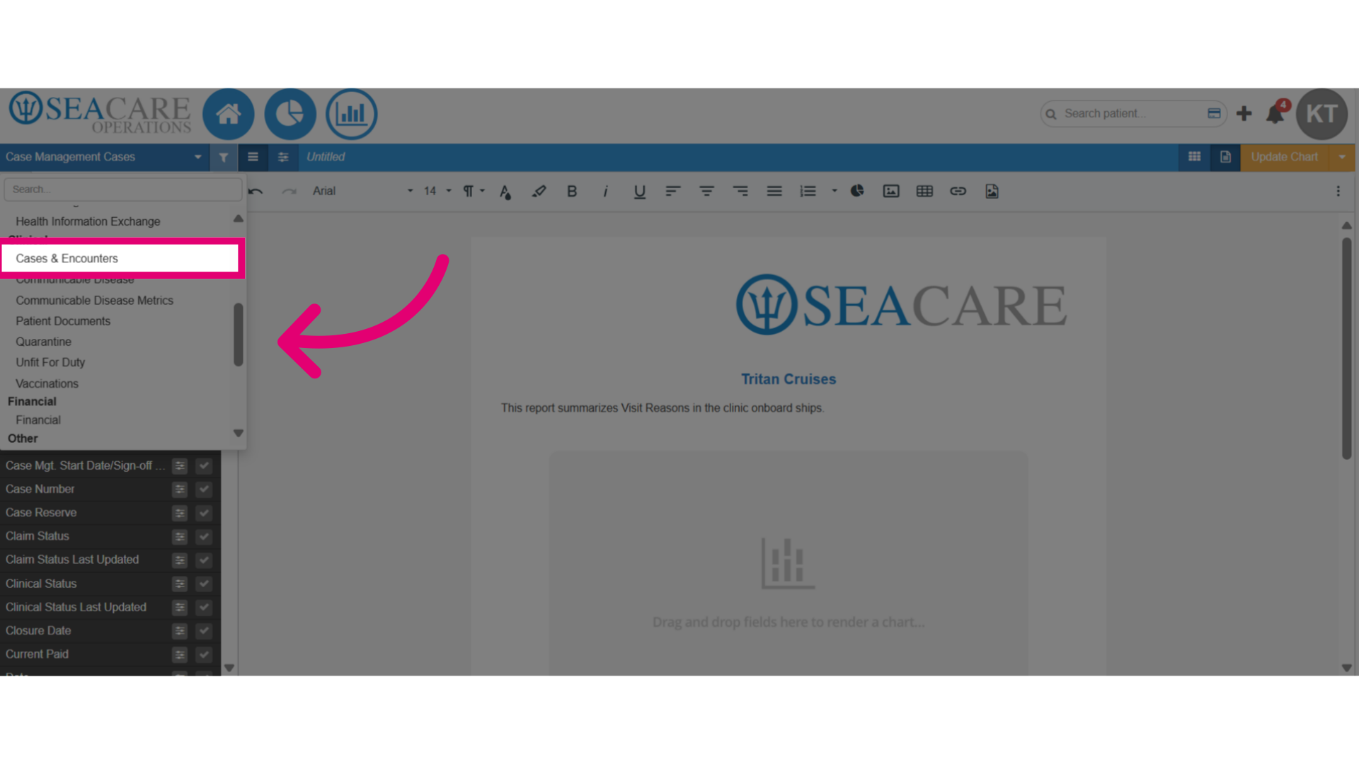
1. Add categories to a chart in the Custom Report Document Editor
1.1. Video
1.2. Steps
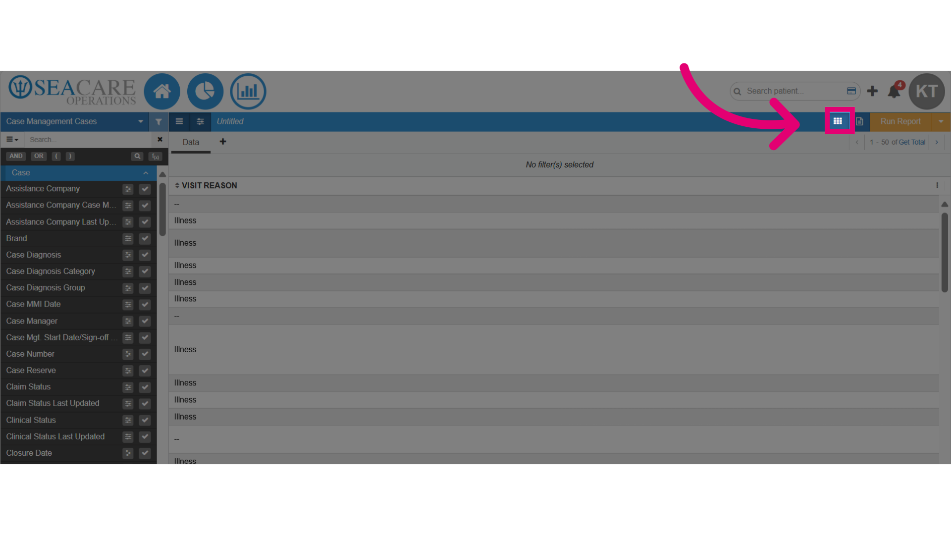
- Begin with your chart added to the document in the Custom Report Document Editor.
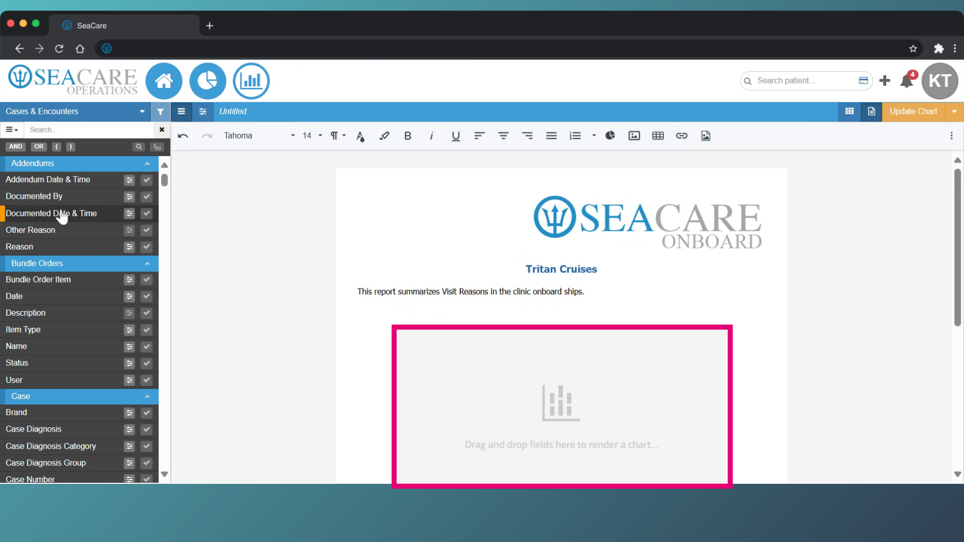
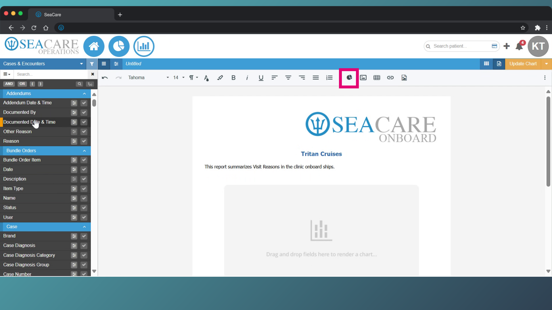
- Add a chart to the document by selecting the chart button from the toolbar.
- Next add your data to the chart by selecting a data field from the reporting area. Reporting areas categorise data into sections with each area consisting of sub-sections with multiple data fields that define how the data is structured. You can select one reporting area to work from options:
- Administration
- Case Management
- Clinical
- Financial
- Other
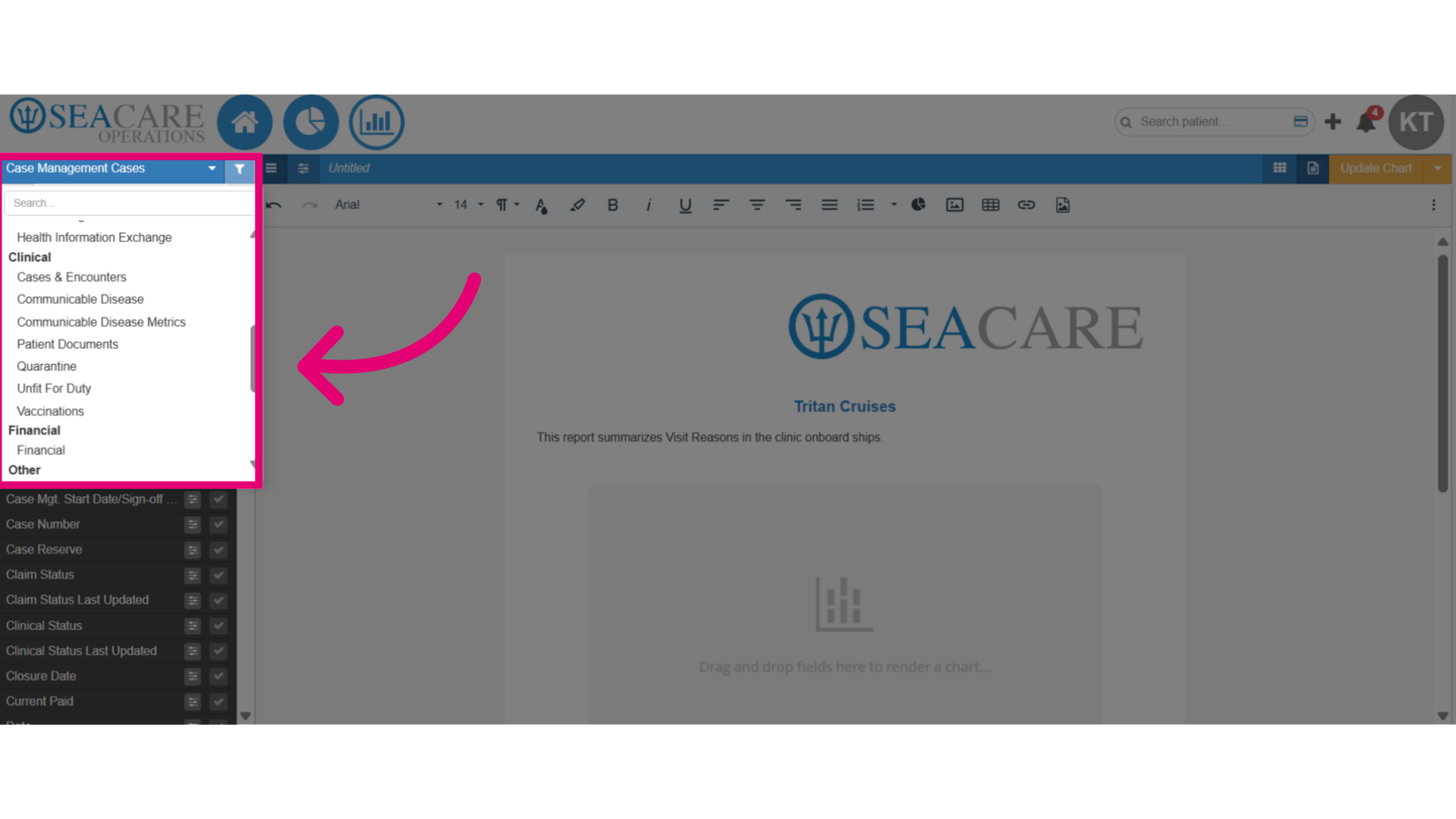
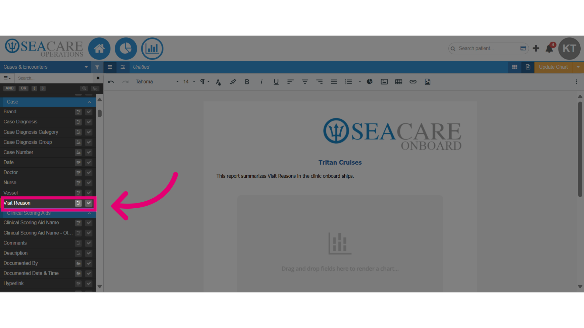
- Next select the sub-section from the reporting area where you will add data to the chart.
- Then, select the data field that will be displayed in the chart, and select as many as the chart can hold such as charts that supports only one data field or those that can support two data fields.

- Drag and drop or double-click to add the data field onto the chart.
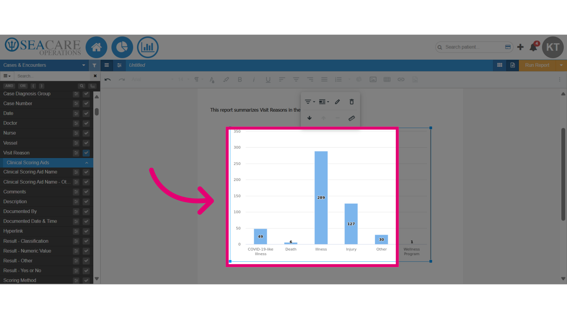
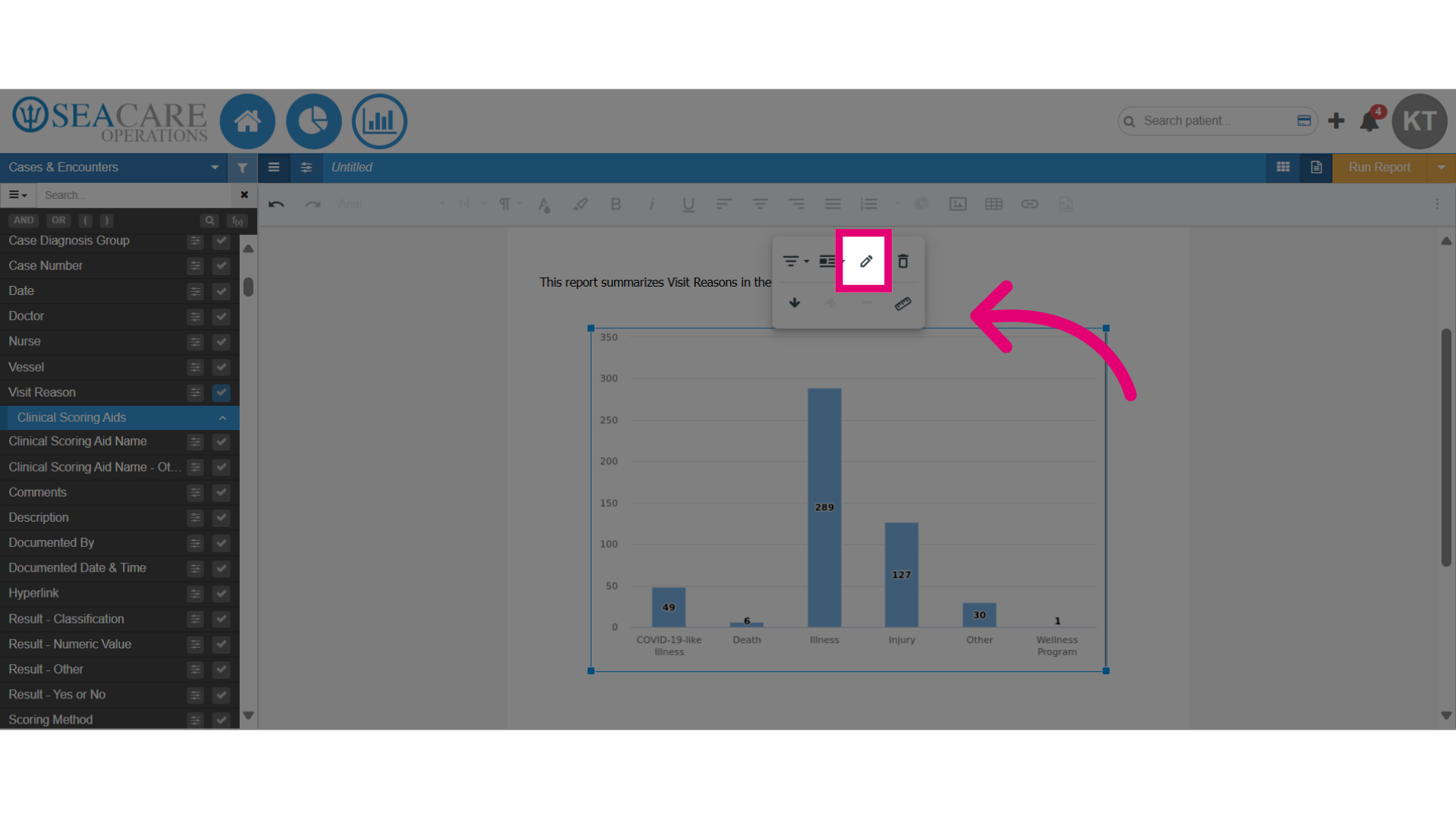
- Review the automatically added data field in the chart, which includes categories and counts on the chart. For instance, the Visit Reason field shows categories for COVID-19, Illness, Death, Injury, Other, and Wellness Program on the X-axis, with counts displayed on the Y-axis.
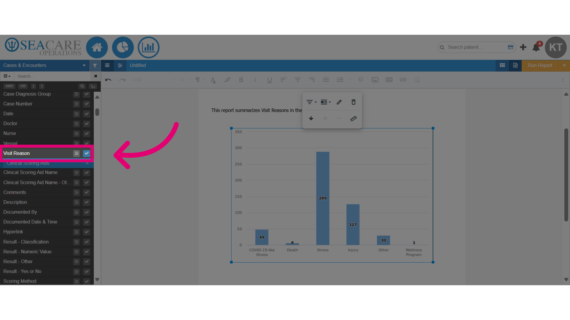
- Next, verify the blue checkmark is highlighted in the sub-section which indicates the data field has been added to the chart.
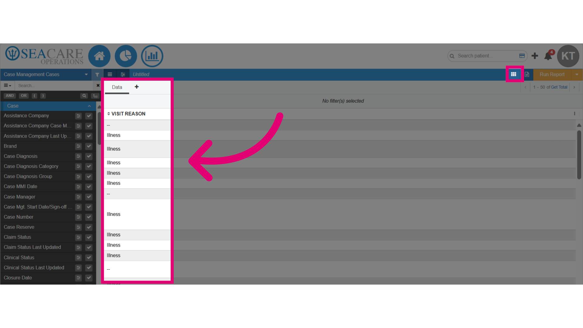
- Click on the Data Editor section to ensure the data has been added here simultaneously where data can be analyzed, and manipulated.
- Review the data displayed in a structured format that organizes the data, for example, such as the categories representing the reason for each visit here.
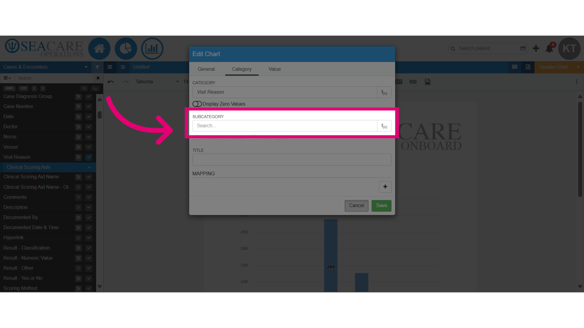
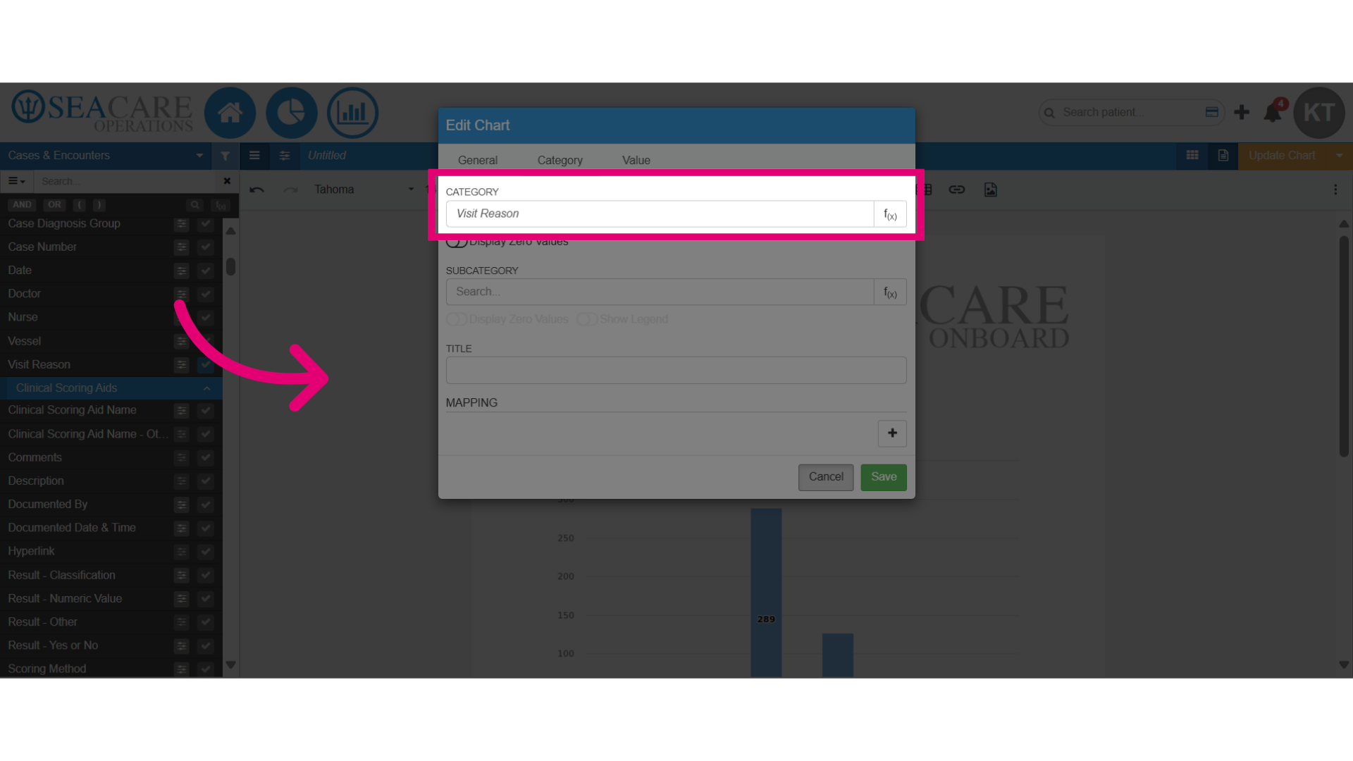
- Begin the process of updating the categories on the chart:
- Go back to the Document Editor.
- Click on the chart to open the editing settings.
- Select the edit pencil icon.
- Then, select the Category tab.
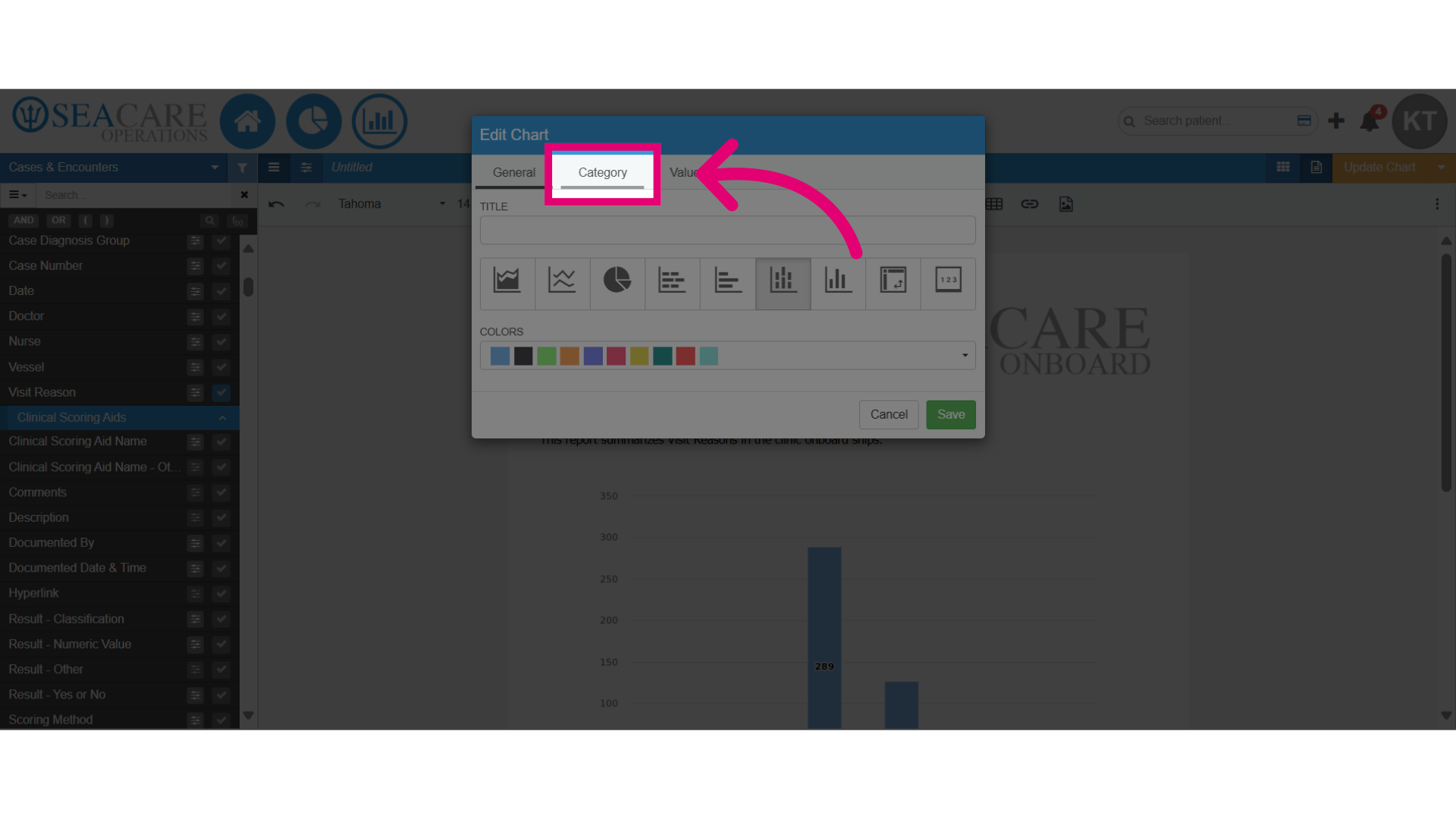
- Under the Category section currently data field chosen is displayed and to change, manually type in another data field from the reporting area.
- To visualise multiple data segments on the chart, do the following:
- Go to the Subcategory section.
- Manually type in another data field.
- Save your changes.
- Review the chart on the document editor with the updated categories.