New article
Recently updated
Editing categories in the custom report document editor

Who is this article for?Users who want to learn how to edit categories in the Custom Report Document Editor.
No elevated permissions are required.
This guide helps you edit categories in a chart using the Custom Report Document Editor. Follow these instructions to customise categories, subcategories, and functions.
1. Editing categories in the custom report document editor
1.1. Video
1.2. Steps
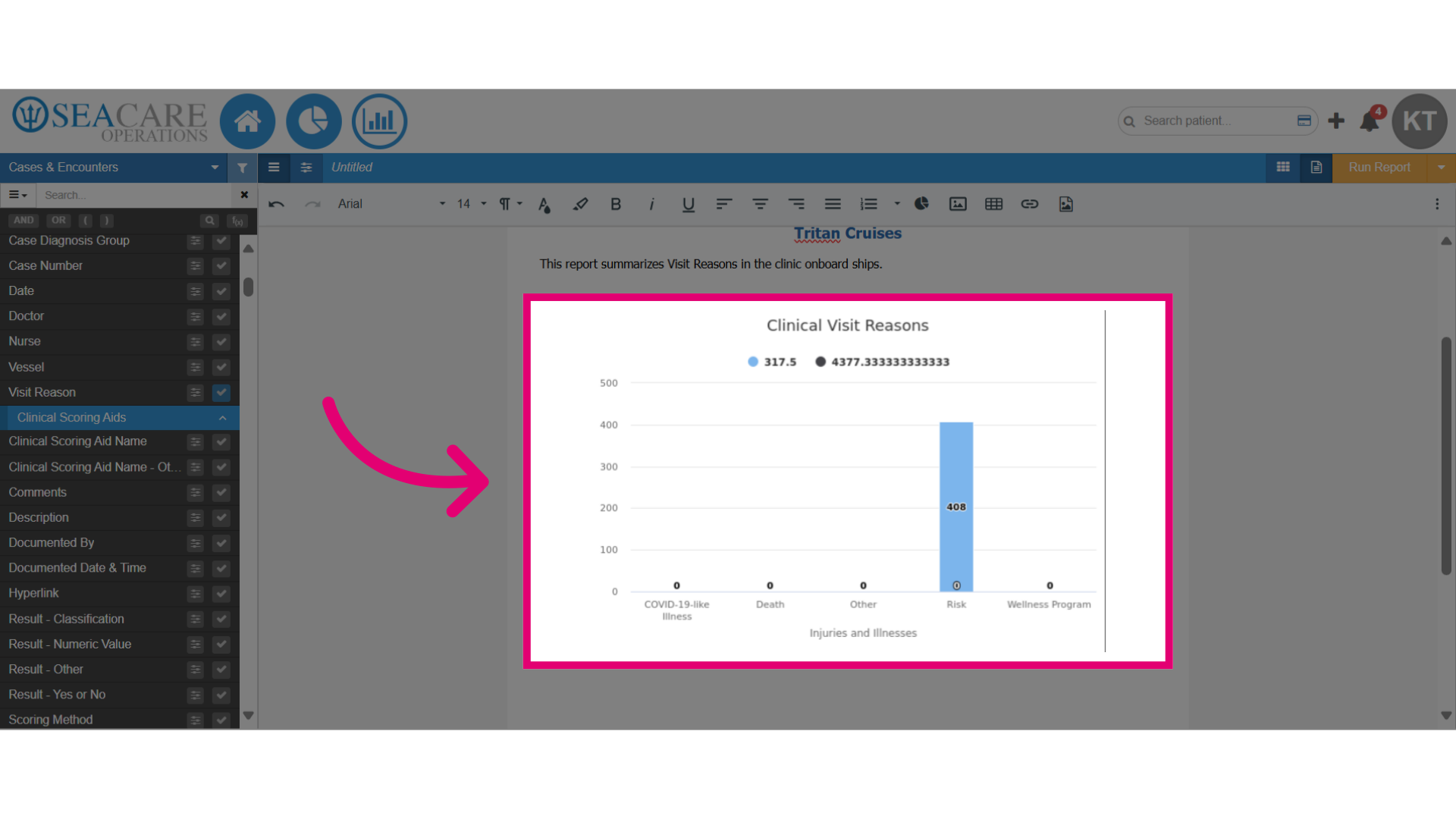
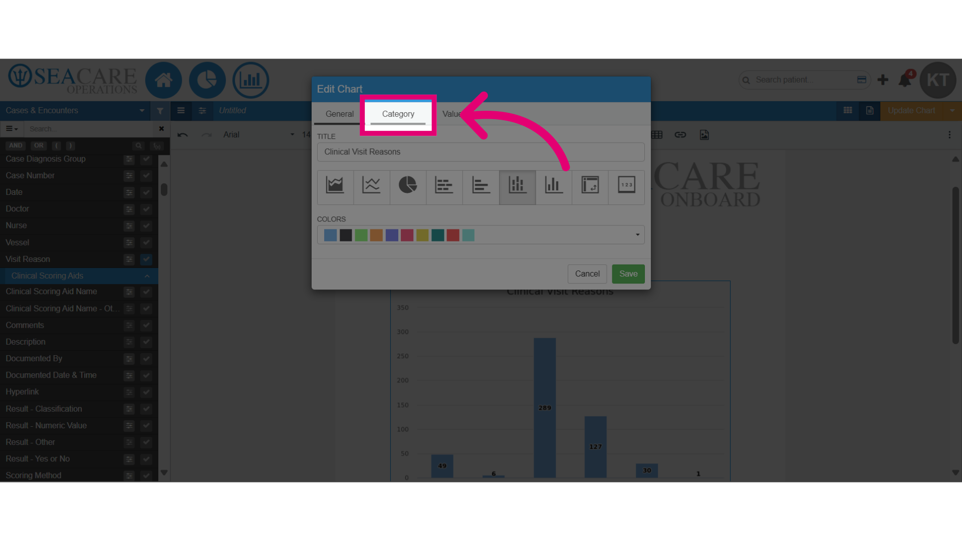
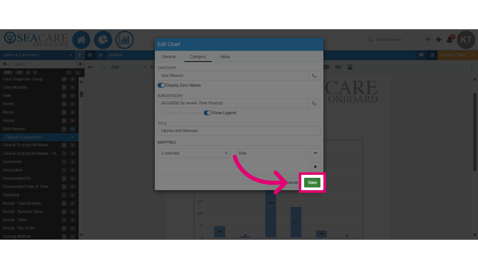
- Start in the Document Editor of the Custom Report, with the chart added to the document.
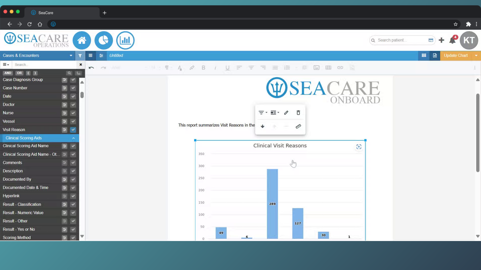
- Double-click on the chart to open the editing options.
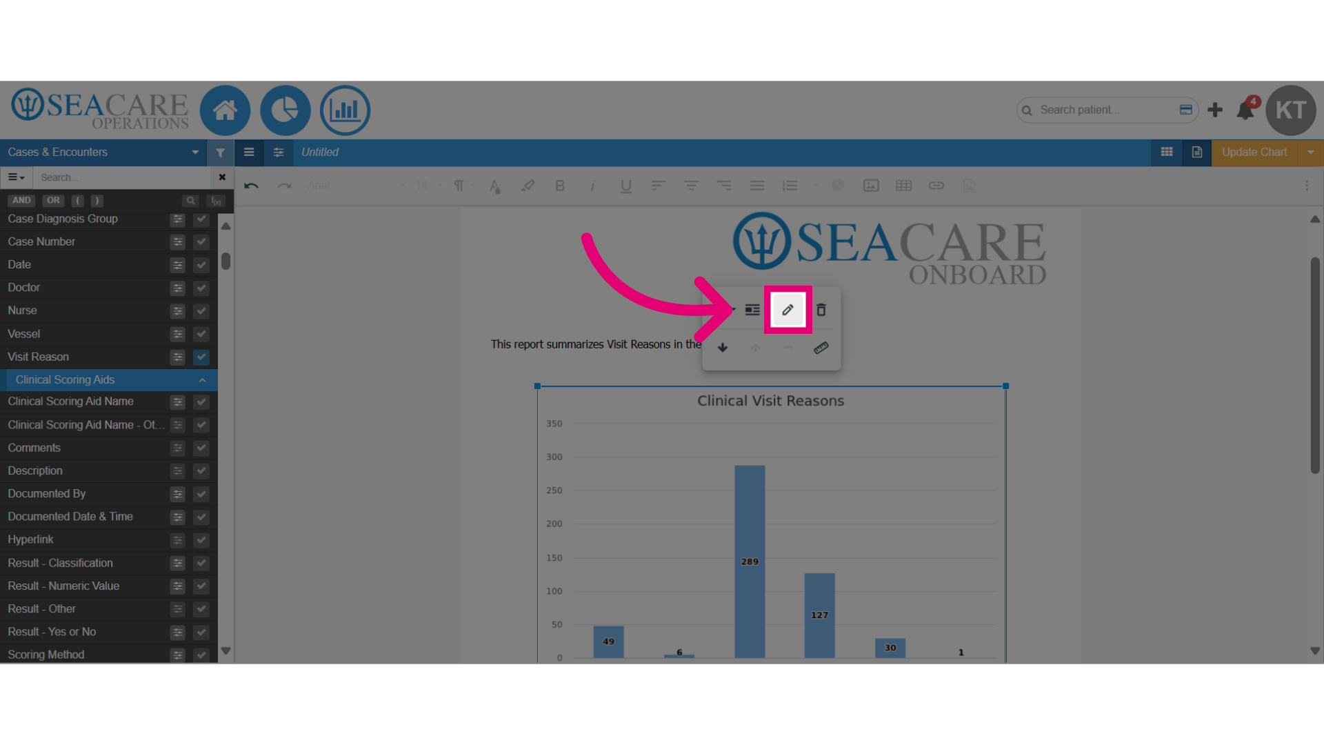
- Click on the pencil icon to access the editing options.
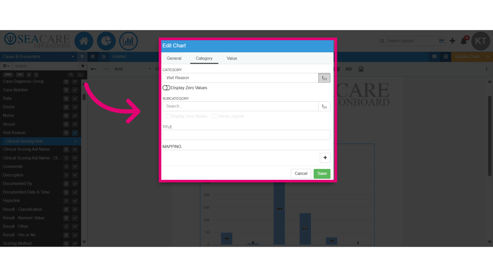
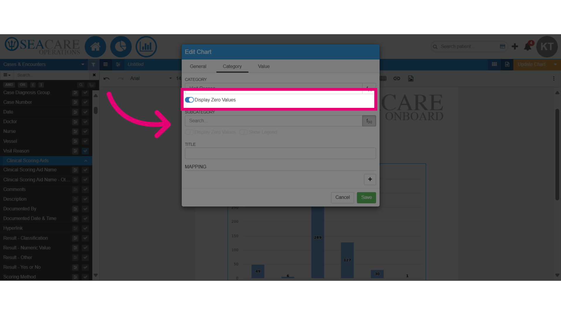
- Select the Category tab.
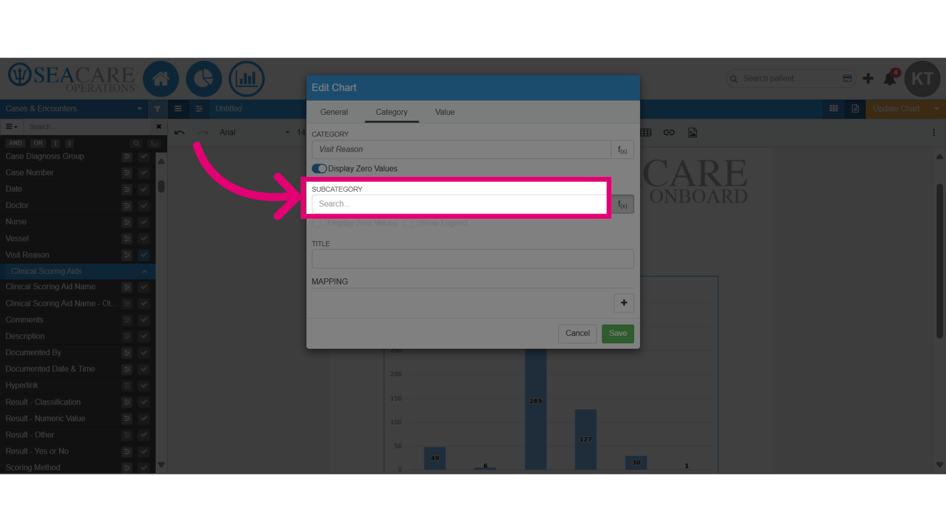
- Here you can make edits by adding the following to the chart:
- Title
- Subcategory
- Mapping
- Zero Values
- Legend
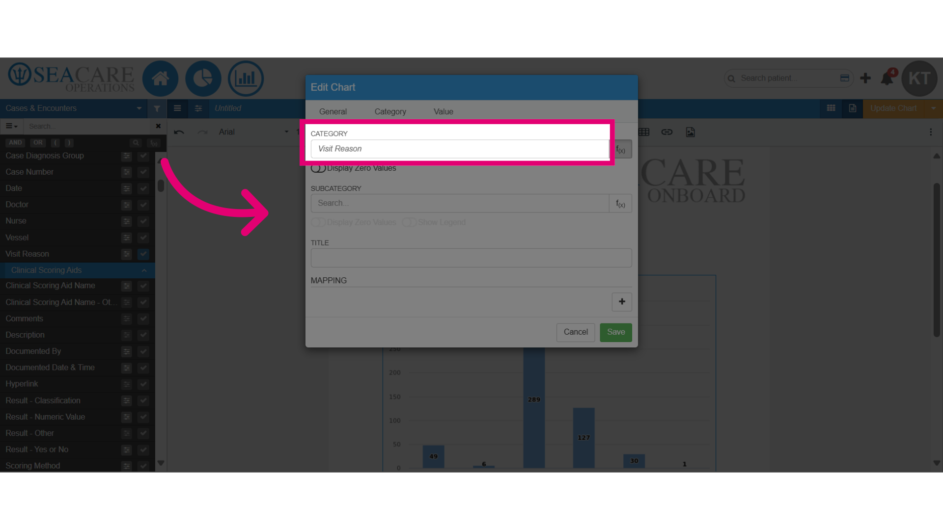
- Change the category by typing in the name in the smart search bar and select the desired category.
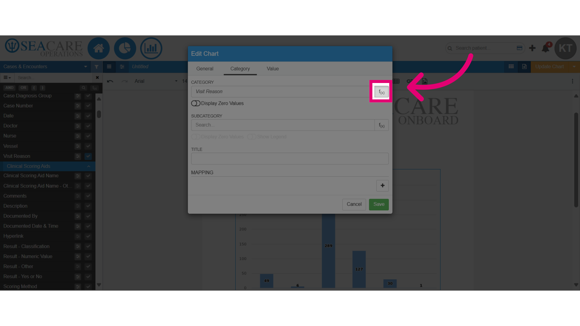
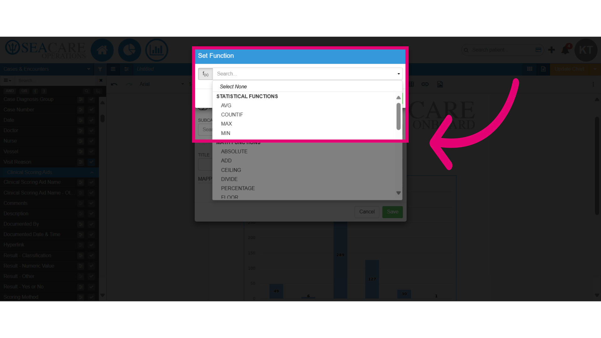
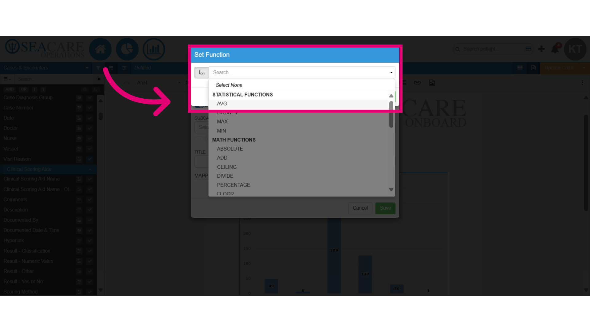
- Click to add a function to the category for data analysis. Adding a function improves your data by enabling you to:
- Manipulate the data
- Interpret it more effectively
- Provide actionable insights
- Uncover trends and patterns
- The Statistical functions can be used for:
- Identifying trends with AVERAGE, COUNTIF, MAX, and MIN.
- Comparing averages across different data or groups.
- Determining frequency of occurrences in the data.
- Identifying the highest and lowest frequencies in the data.
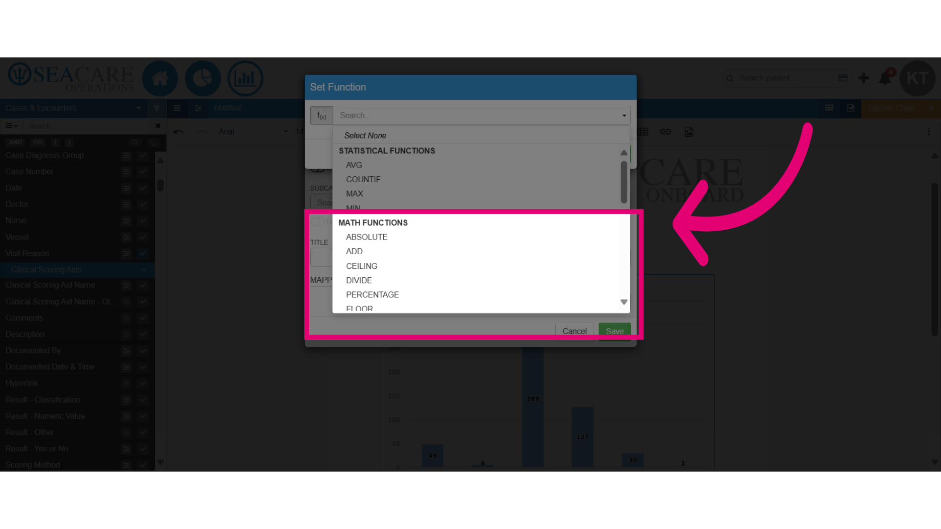
- Use Math functions to analyse numerical data in your chart for:
- Add - Sums values.
- Divide - Divides values.
- Percentages - Converts to percentage.
- Multiply - Multiplies values.
- Subtract - Analyses differences.
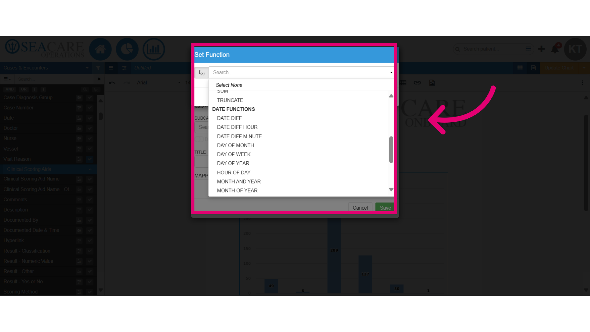
- Utilise Date functions for date categories by selecting a function to:
- Calculate the difference between dates
- Extract details like the year or month.
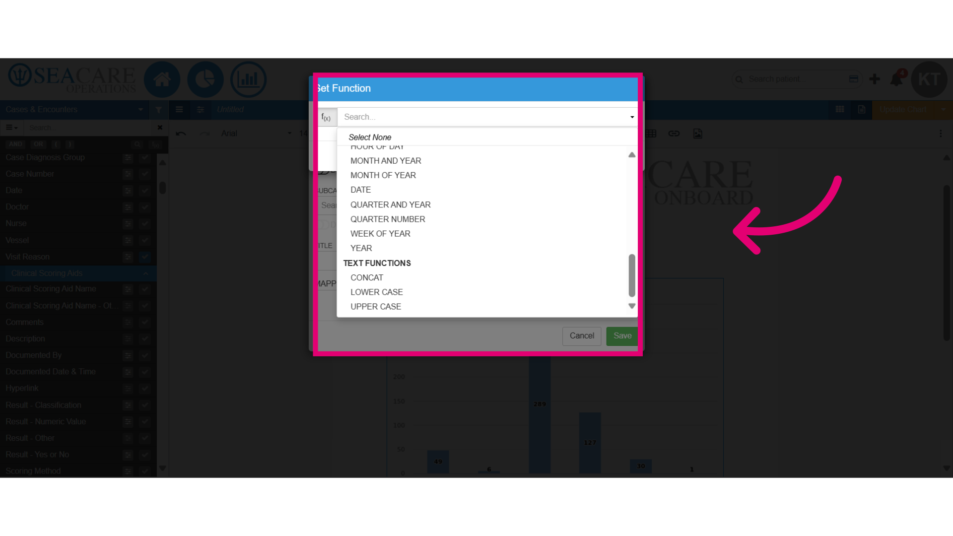
- You can use different text functions to concat text or change it to upper case or lower case.
- Add zero values for the category results so categories or items that currently hold a value of zero are visible in the chart.
- You can add a second subcategory to analyse two data points on a chart, but ensure you use a chart type that supports this, like a stacked chart or bar chart.
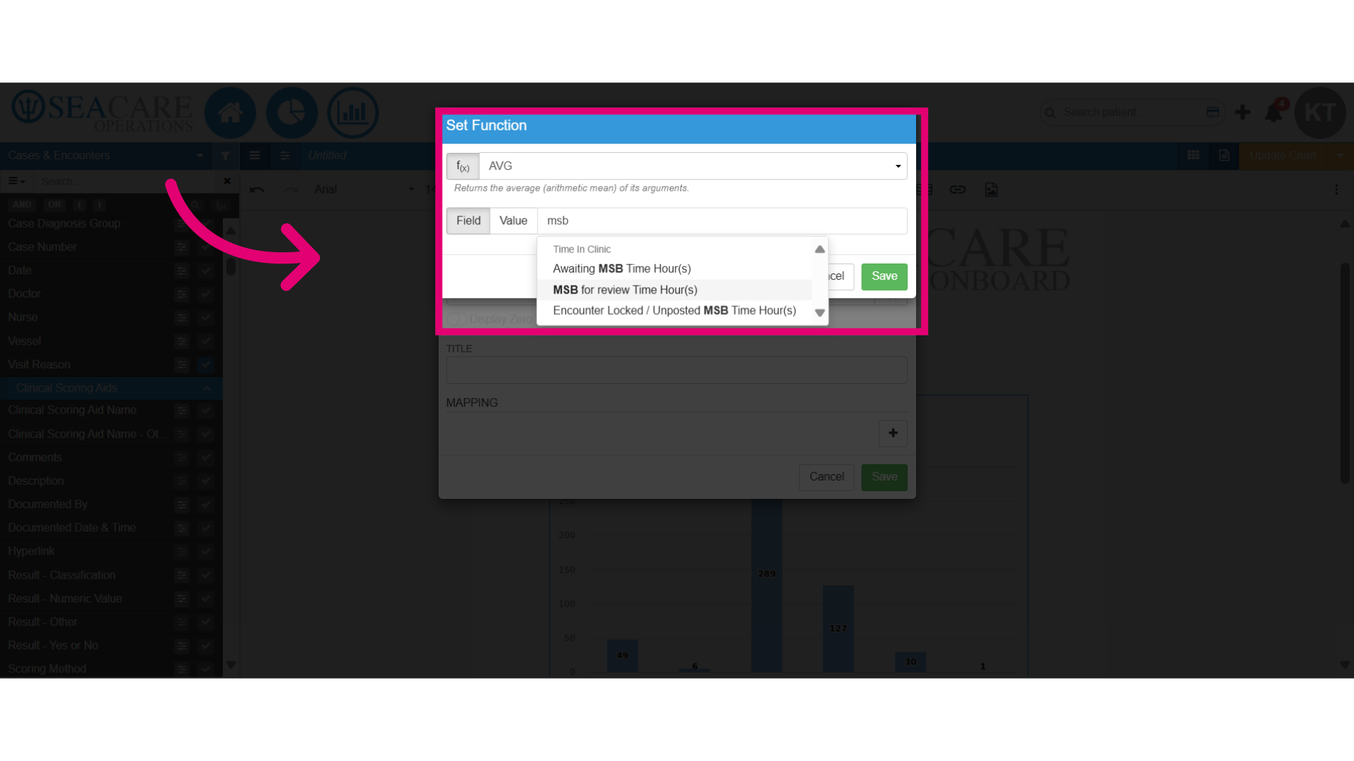
- To add a function to a subcategory, simply click the f(x) button for that subcategory.
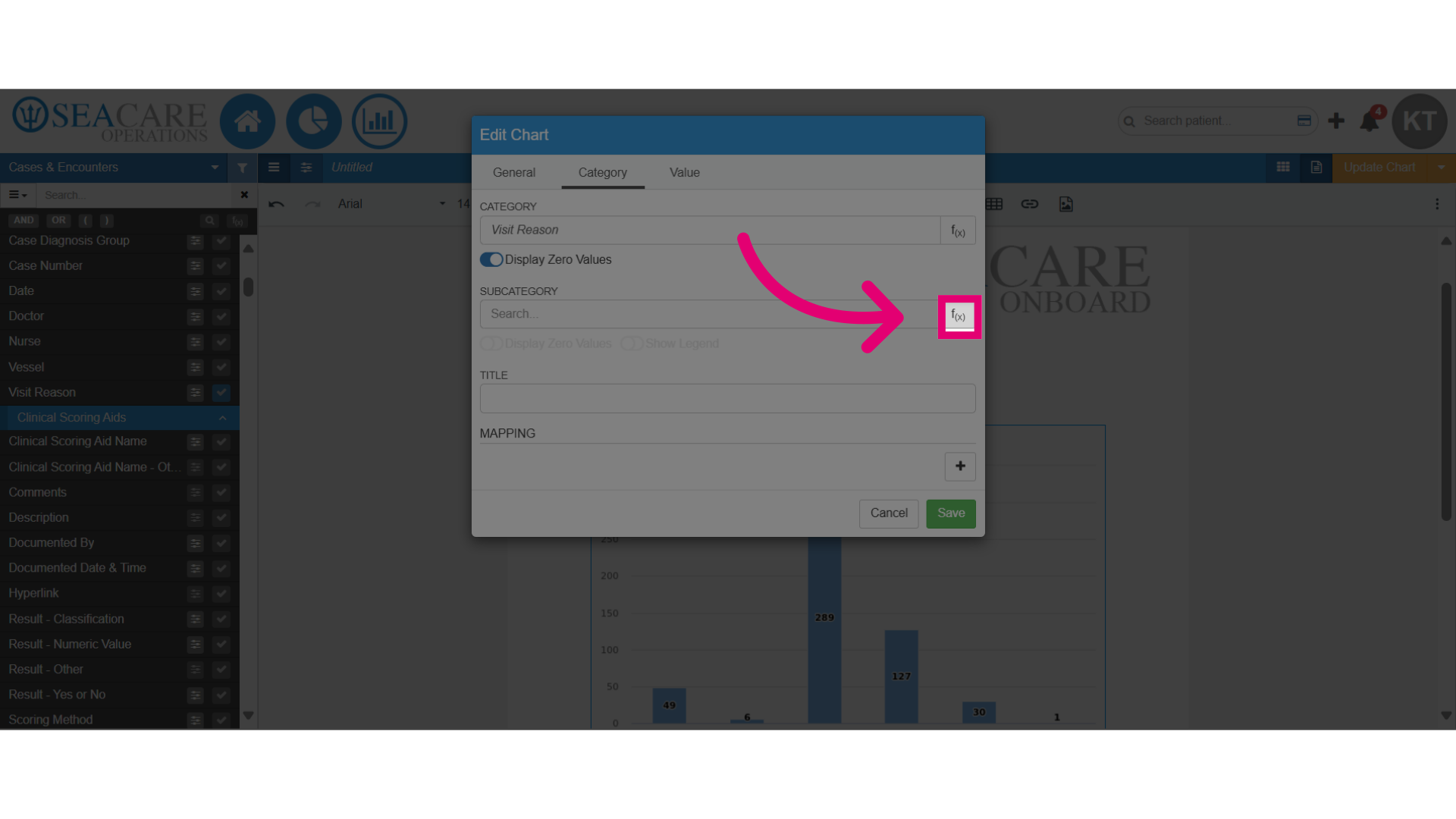
- Let's open the functions window and add a subcategory, like the average (Avg) function.
- Next, enter the field name in the smart search and select from the matching options.
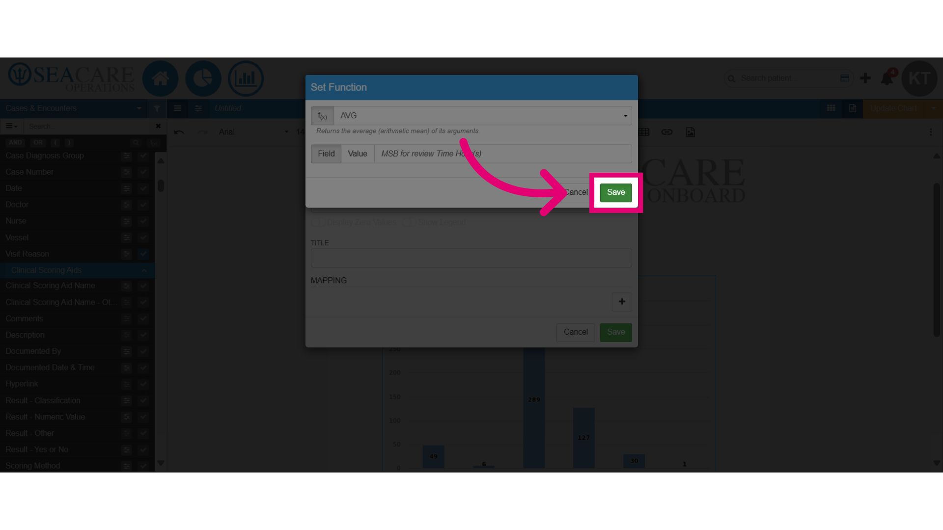
- After making the selection, Save the changes made.
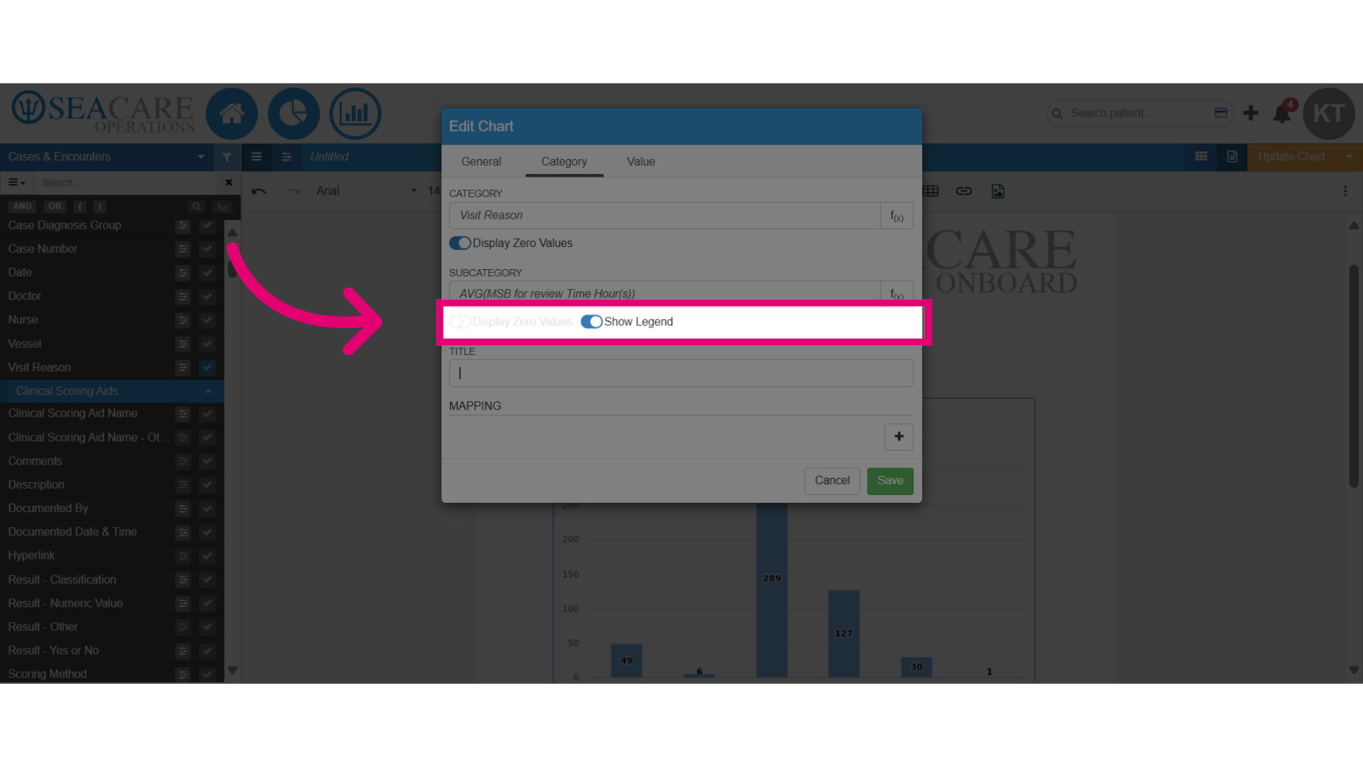
- Next, enable the legend to identify the data in the chart.
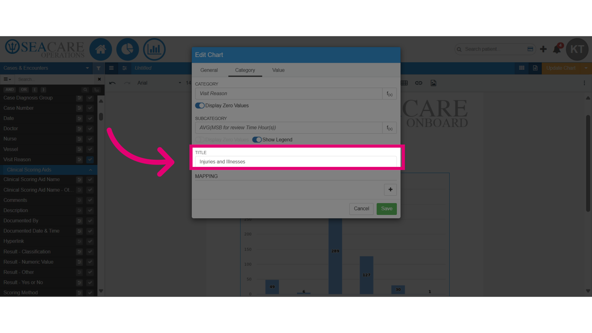
- Add a title for the chart.
- Use the mapping feature to merge multiple data points into a single value, offering insights into trends. Start mapping by clicking the plus sign to add each data point you wish to combine.
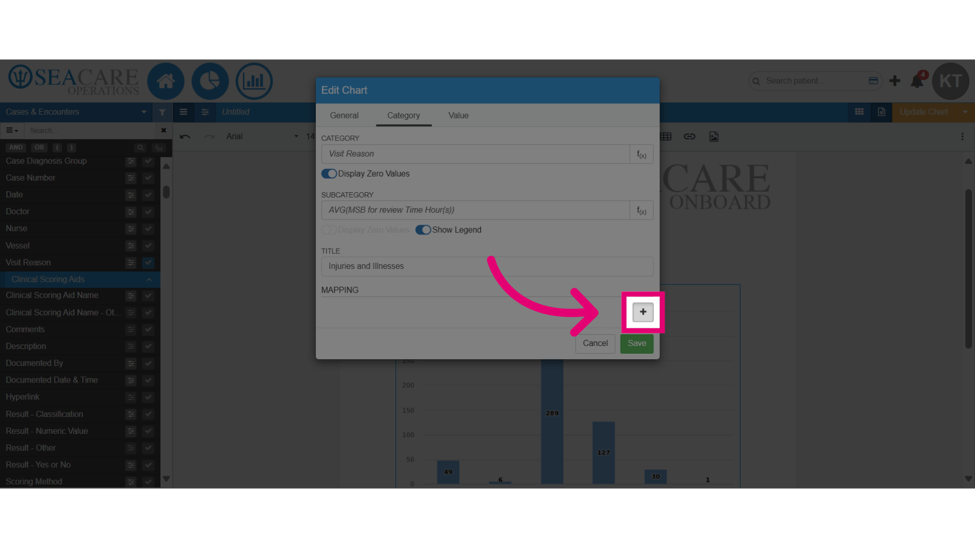
- Next, choose the data points to merge, like selecting multiple visit reasons.
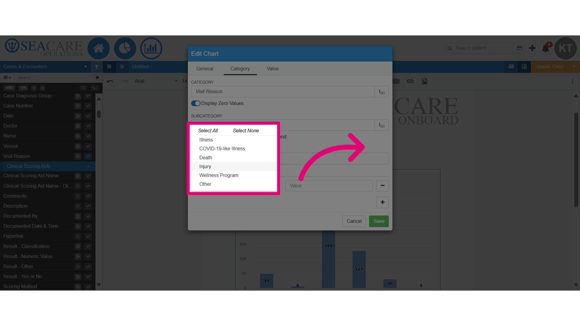
- Confirm the accuracy of the selected number that will be merged.
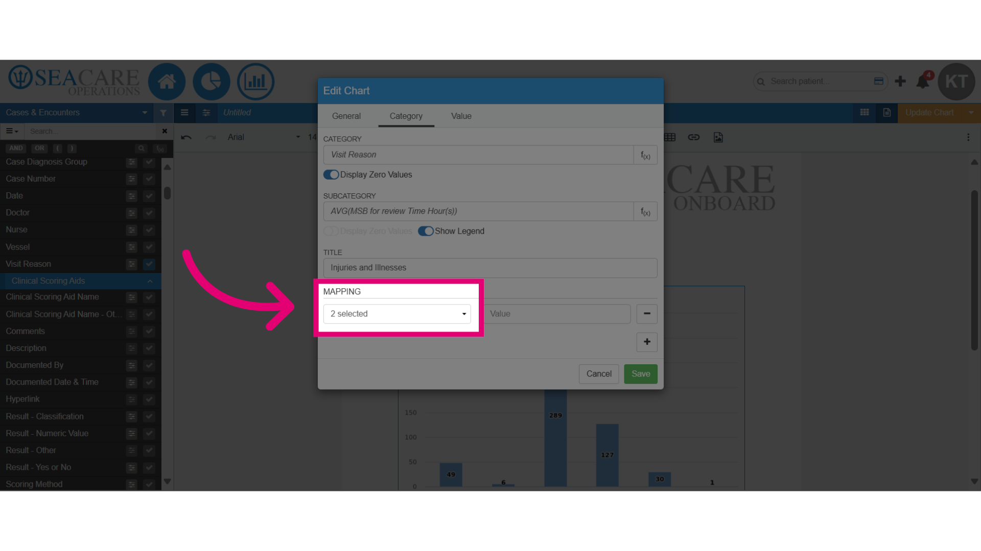
- Include the value for the merged data, such as the name.
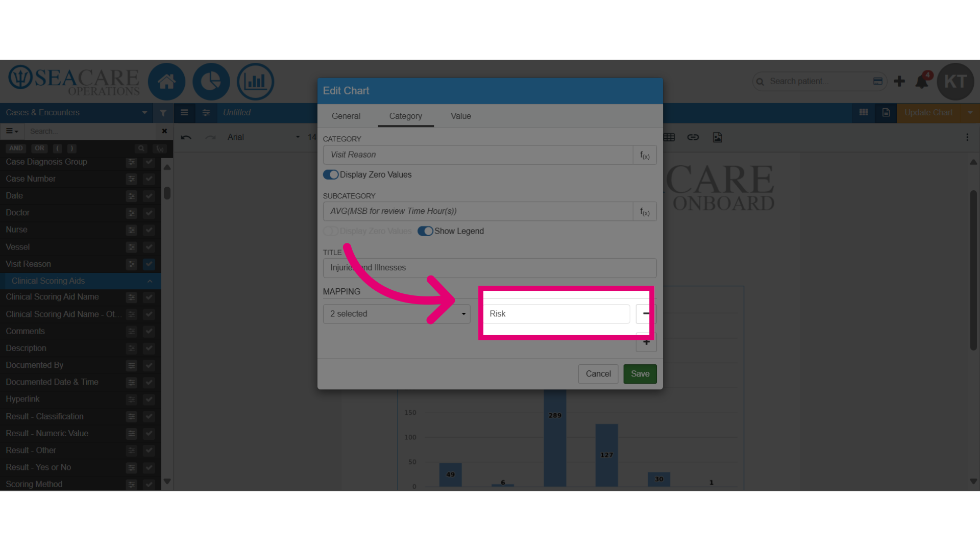
- Save the changes.
- Examine the improved chart, which now offers a clearer visual representation, incorporating updates on:
- category
- subcategory
- functions
- mapping
- titles
- legend
- zero values